Visualizing patient journals and EMBC 2016 in Orlando
- By : Adnan Vilic
- Category : Projects
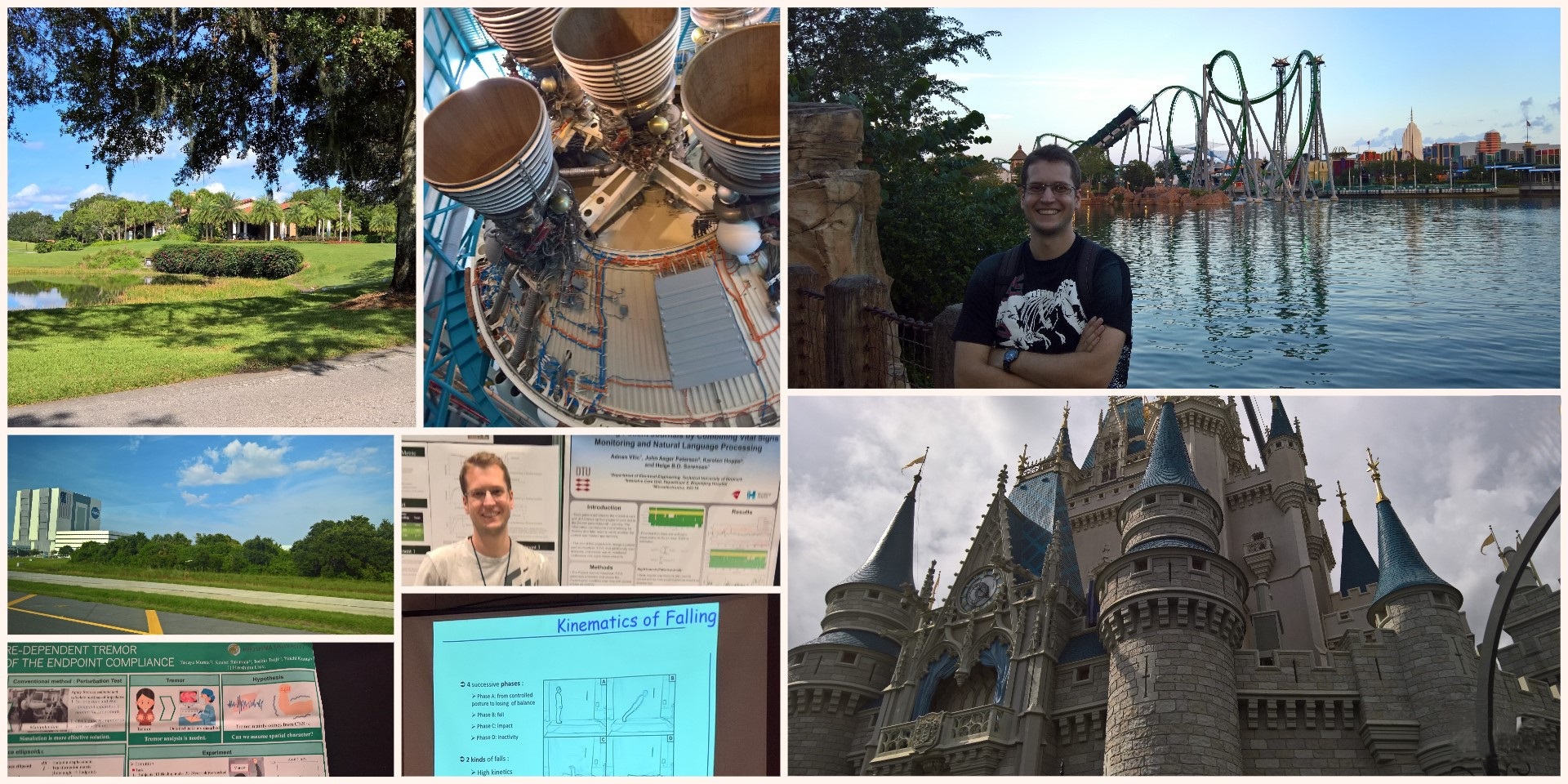
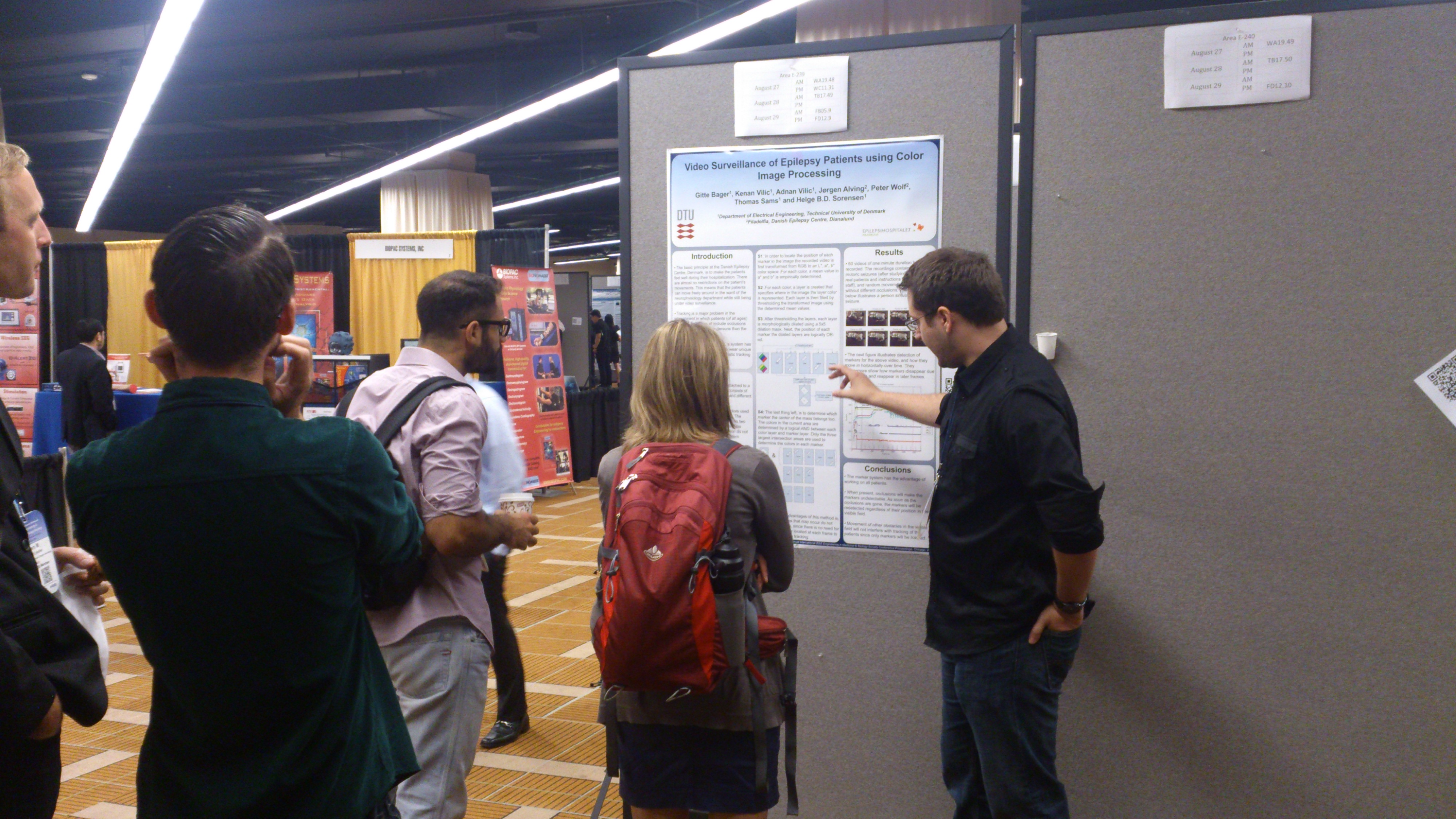
Due to a sickness I was unable to participate at conferences last year, but after a full recovery, I was at EMBC in Orlando, Florida (USA), and I participated with my first PhD-related project.
The project presents a data-driven approach to graphically present text-based electronic health records (EHR) of patients, while still keeping all textual information. To do so, a timeline representation of a patient’s physiological condition (how healthy/sick the patient is) is created for an entire admission.
How it works (very briefly): First we need electronic measurements of vital signs (blood pressure, pulse, temperature, oxygen level in blood, and breathing speed, aka. respiration rate) and the EHR of the patient. We start off with estimating the physiological condition by using a model called Early Warning Scores (EWS) which simply states how bad your vital signs are compared to “normal”. Next, Natural Language Processing (NLP) techniques are applied on the patient’s EHR to extract all entries. Finally, the two methods are combined into an interactive timeline featuring the ability to see drastic changes in the patient’s health, and thereby enabling staff to see where in the EHR critical events have taken place.
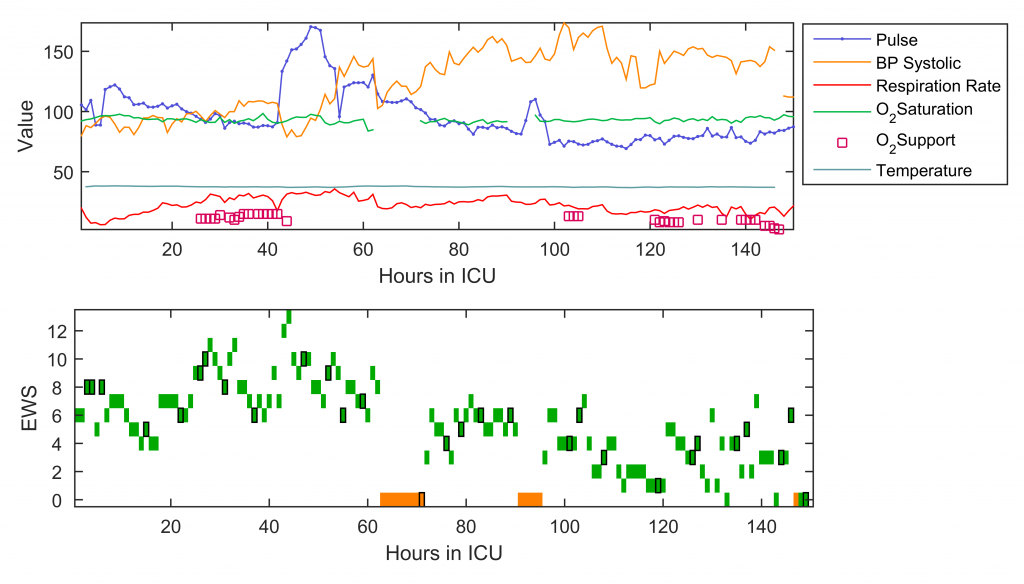
The graphs above are for a patient who was admitted to an intensive care unit for about six days. The top graph shows raw vital signs measurements, where the attention is immediately drawn to the area about 45 and 90 hours into the admission where there are spikes in pulse. The second figure shows our estimation of physiological condition where it is easier to see that the condition started deteriorating already 15-20 hours earlier. To see details at “any” given time on the bottom timeline, the user can press on a square with black marking, which will pop up with the EHR entry related to that specific time.
Apart from verifying the system on individuals, it’s also interesting to see how the model works for a population.
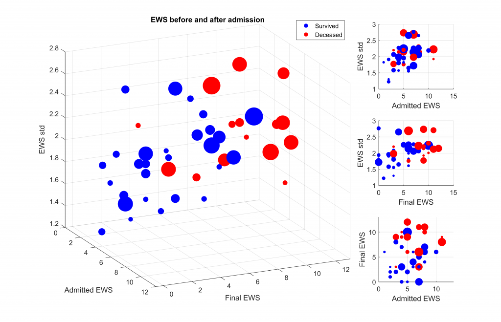
Each ball in the graphs represents a critically ill patient, color indicates mortality and size is duration of admission. Not very surprisingly the “healthier” subjects, that have low EWS survive.
There is of course much more to it, but that’s what scientific journals are for – this one has yet to be reviewed and published though.
Since the conference was located in Disney World in Orlando (including entrance discount for conference participants), there was also time to visit the theme park….along with Universal Studios, Kennedy space center, and some shopping few hours before departure.

No Comments